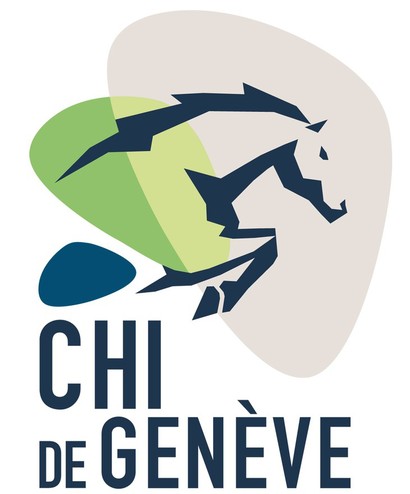
The Concours Hippique International de Genève decided this spring to change the logo of their event. After some 15 years of loyal services from the previous graphic design, it was thought essential to uplift the event with a more modern image.
The artist behind this new logo, Emilie Lacroix who was already the creator of the beautiful visuals for the CHI in 2013, took a more contemporary and energetic approach to the previous graphics of the horse jumping an obstacle. An implied reference has been introduced in the logo with the lake of Palexpo. The lake is trebled to underline the intensity of the event, bringing together competitions, attractions and expositions.
In regards to the colors chosen, they too are three; beige in reference to the indoor event on sand that is the CHI Geneva, green in allusion to the past logo and blue for the water in the lake.

